
Notes on the tweaked Times
It has taken me four-and-a-half days to get my thoughts together on this one, which in blog terms might as well be never, but it's worth looking at some of the ways The Times may have learned from the Guardian redesign. The wedge serifs on its new headline font, Times Modern, are coincidence: we have it from the designer that the inspiration is an old Times titlepiece, and you can see the family resemblance. (All these links, by the way, are from the excellent Newsdesigner and its commenters -- go there for an overview of what's been done, and links to the official Times explanations.) But consider these:


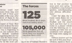
The top one is the Guardian, the bottom one The Times. Now, lots of papers are trying to give their readers more summary information on stories, and more 'entry points' for reading - but settling on a pair of double-line subheads in the first column, separated by hairline rules, and with extra space under the second line in each one, seems a bit too coincidental. It's not a theft or any kind of misdemeanour, but it does suggest that the Times redesigners, Research Studios, read the Guardian pretty closely.
The next case shows more divergence:

This is one of the little breakers the G now uses to lift text-heavy pages, next to one of the grey boxes the T is putting to similar purposes. The T's are bigger and more flexible and less inclined to appear in the middle of text, which suggests they're the result of shared pressures rather than direct inspiration.
The third case is actually trumpeted in the T's description of its new style -- greater differentiation for comment bits on news pages:

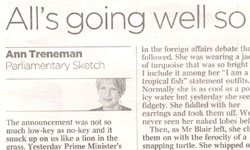
Again, G followed by T. Ragged-right text for comment, once a G eccentricity, seems to be becoming an industry standard: the T is going about it much more beefily, however, adding bold to the text and using a radically different headline type rather than just a slightly lighter one. The result looks like something out of the G from before its latest redesign -- except that it used to use serif headlines on comment and sans on news, whereas the T follows the opposite policy.
The G, then, continues to wield design influence beyond what its circulation performance would lead you to expect. (That may be because so many designer types read it, rather than because of simple merit.)
General T redesign verdict? I quite liked the tabloid as it was; this wouldn't put me off, and has the potential to draw me in to pages I'd previously have skipped. The feel is a tad more conventionally tabloid, though, because busier and, in places, more tightly spaced -- not sure they've fully compensated for the bigger X-height of the new headline font, especially in single-line headings.
![]()

5 comments:
I must say I'm rather impressed by the redesign of the Times: I really like Times Modern's wedge serifs for display, it's very readable as body and the increased use of sans all over the paper gives it a much cooler feel. But although I take your points about the influence of the latest Guardian redesign all over the new Times, the basic strategy is different. The Guardian went from a serif-plus-sans mix (Miller plus Helvetica) to setting nearly everything in serif (Guardian Egyptian); but the Times has gone from setting nearly everything in serif (Times Classic) to a serif-plus-sans mix (Times Modern plus Gotham).
The worst thing about the Times is the bloody crest on the masthead. Who needs it?
Agreed, agreed -- the only good crest in the Times is the one on the leader page, which is even uglier but at least means something.
I like the redesign as well, and I don't think it's the result of orders to make the Times more Guardian-like. It's an intelligent accentuation of the way the paper had already gone -- trendier, less gentleman's-clubbish; a bit more populist, with outbreaks of comment and fluff to liven up the news pages, but with a concerted effort to keep broadsheet story count and differentiation between news and comment. If the people commissioning Times Modern named a font they liked, I'd lay money it was Miller Headline -- combines tapered serifs with a high count and the up-and-down emphasis of Times Roman or Century Schoolbook, and it's all over the Daily Mail.
But I can see bits of the Guardian redesign noticed and adapted in the Times in a way I can't see bits of the Indy's big redesign (just as well -- it turned me from a regular reader to an almost-never, though sheer bad text handling) or the Observer's. That struck me as all the more interesting because the overall aims and approach were clearly different -- although I ought to have thought and said that more clearly.
Oh, and I thought the body text was still Times Classic? It's certainly readable, whatever it is.
I agree with you entirely about the Independent, which is unreadable because of handling of text. On the text font for the new Times I could well be wrong about the use of Modern: I've not yet looked at it under magnification and have no moles to tell me. But I don't see Miller Headline in the frame as Brody's inspiration for Times Modern, I'm afraid. I think he was looking back at Century Schoolbook and all those marvellous faces from the golden age of hot metal when moving towards block serif (but not quite going the whole hog) was the way to beef it all up. It's a very un-Morisonian Times face, in other words, and I like it, like it, yes I do...
Don't know about the print, but the redesigned website is dreadful. Can anyone find the law section anymore??? I emailed them to ask WHERE it was - no reply.
http://business.timesonline.co.uk/tol/business/law/
Don't mention it.
Post a Comment