Showing posts with label Type; art; design. Show all posts

Saturday, January 02, 2010

More endurance

About 10 years ago, I saw a takeaway in Hyson Green, Nottingham, with a name that suggested the area might have something of a drug problem. But over time I started to think I'd imagined it, or subconsciously improved it. Then I visited some kind friends in the area for new year, and it's not only real but still there:


View Larger Map

The handpainted sign is also very cute, no?

Saturday, March 28, 2009

Street View abecedary: J is for John, but which John?

Strange how, at least if you're as word-obsessed as me, a view can rearrange itself around a piece of lettering. This stretch of Stockwell Road is in many respects rather generically contemporary, for a long-timescale, fairly cynical value of contemporary: some boxy 60s or 70s flats, a boarded-up shop and a fried-chicken francise - which might be very good, for all I know; there's a branch of the same microchain in Sydenham, but I haven't tried it. And then there are the fading painted advertisements on the gable end, which suddenly anchor the picture in the 40s or 50s:


And in Googlecontext:


View Larger Map


The first product advertised is easy to identify: everyone knows Picture Post. Its photography was famous, and its publication dates place these advertisements somewhere between 1938 and 1957. The second, broken panel is trickier. John who? If it's another magazine, then the obvious answer is John Bull, a popular weekly that seems to have been known at different times for rabble-rousing patriotism and nice illustrations. (The two aren't mutually exclusive, of course.)

Wikipedia is entertainingly vague about John Bull, noting a scatter of dates when it definitely existed and concluding that it "may have closed in 1962". You can do much better with the British Library newspaper catalogue, which traces the main 20th-century carrier of the name - the magazine that was famously edited by Horatio Bottomley - from 1906 to 1958, then through a flurry of minor rebranding as it swallows a couple of other magazines, and then to a relaunch in February 1960 as something called Today, which itself comes to an end without any word of continuation in 1964. John Bull clocks up the best part of 2,800 issues in 54 years, which suggests more or less continuous weekly publication over that span. It's easy to imagine it being advertised alongside Picture Post.

That would have been a nice neat story, and I wish I could fully believe it. I had thought the two magazines shared an ownership, but it looks like that's wrong - Wiki does have Hulton, which owned Picture Post, selling out to Odhams, which owned John Bull, but only after Picture Post had closed. Another piece of evidence is a selection of John Bull covers on sale at the Advertising Archive. These have good, consistent branding, in a series of different serif styles that have little in common with the punchy, jauntily arranged sans on this wall. I suppose it could be a John Bull look from before the Advertising Archives' holdings - those seem to start in 1946 - but it could easily be another John altogether.

You'd need street directories and old photographs to get the full story, I suspect - Google, even with Street View, has its limits. This series will continue to explore them on Wednesday, when my alphabetical hopscotch will land on the letter B.

Wednesday, March 25, 2009

A Street View abecedary: R is for Regen's

So I was fiddling with Google Street View, and it occurred to me that my long-in-abeyance London letters series, about the lovely vernacular lettering you can see on London's streets, would now be childishly easy to revive: Google has taken all the photographs. No more blurred shots! Or at least, no more blurred shots that are my fault. This could actually be good now.

I'm going to start the new, sinister-global-conglomerate-powered series on Rye Lane, Peckham, a classic slice of shabby south London full of shops and signs of wildly divergent age and type. This is a cropped screengrab of my favourite combination:

And here it is in Googlecontext:


View Larger Map

Now, the first thing I like about this is the hand-cut irregular charm of the sign, and the way it clashes with the intended art-deco sleekness. Look at the difference in emphasis between the upper-case 'R' and the lower-case letters next to it, the strangeness of the lower-case 'g', the extreme slope on 'for', the vestigial apostrophe.

But what makes it treasurable is that, to judge by the scuffing on some of the letters and the mess either side of the panel, this sign has been rescued from behind several erected by later retailers, because the owner of the lingerie shop it now advertises either (i) couldn't be bothered to put up their own sign, and instead just kept peeling back until they hit a nice one; or (ii) is impishly pleased by the description of their wares as "baby linen". Or it could be both. In any case, it's very south London.

Bonus Street View question: is it me, or has Google's privacy-protection bot blurred out the face of the shop dummy on the right?

Thursday, February 28, 2008

The typographical totalitarianism of Barack Obama

The thing that sort of flabbergasts me as a professional graphic designer is that, somewhere along the way, they decided that all their graphics would basically be done in the same typeface, which is this typeface called Gotham. If you look at one of his rallies, every single non-handmade sign is in that font. Every single one of them. And they're all perfectly spaced and perfectly arranged. Trust me. I've done graphics for events --and I know what it takes to have rally after rally without someone saying, "Oh, we ran out of signs, let's do a batch in Arial." It just doesn't seem to happen. There's an absolute level of control that I have trouble achieving with my corporate clients.

-- Michael Bierut interviewed on the graphic design of Barack Obama's presidential campaign, at Newsweek's "Stumper" blog.

Do you think anyone's told Jonah Goldberg?

Friday, February 08, 2008

Insufficiently Scandinavian

Cheap furniture vs Donald Judd artworks, a quiz. I scored a mere 58%. My excuse: I found the link at Design Observer, which told me that the quiz was Ikea vs Donald Judd, and so I voted on the basis that anything that didn't look fully functional and maximally economical as furniture was art. In fact it's Wal-Mart vs Donald Judd. Wal-Mart, on this evidence, sells some pretty silly furniture. (Very Short List, where Design Observer found the link, got the sources right.)

Friday, July 27, 2007

Even more random than usual

These books look very cute, if you have children of drawing-and-colouring-in age: a good gimmick ("Just add heads and arms!") executed with wit in an appropriate hippie-Victorian-ish style. While we're plugging, I should say that I ran across them in this exquisite design-geek boutique; which, among other virtues, is the kind of environment where a lone fat bearded man can leaf through a colouring book without anyone getting the wrong idea.

Tuesday, April 24, 2007

London letters 4: Hat factory, Hollen Street

This is the Henry Heath Hat Factory, a fragment of the old artisan Soho jammed right up against Oxford Street:

What's shown is the back; the front was presumably a shop even in Victorian times. The building, according to listing records, dates from the late 1880s, but the address dates back further than that. There's a pamphlet in the British Library's Evanion Collection of printed ephemera that was handed out at the 1884 International Health Exhibition in South Kensington - they had a demonstration there - and gives the firm's address as "Ye Hatterie", Oxford Street, "as in the reign of King George the Fourth".

The pamphlet is marvellous. It boasts of Henry Heath's contribution to "rational dress" (a "soft-fitting" riding hat for ladies, as recommended by the coursing correspondent of The Field) and his warrant as "Hat Manufacturer to King Alphonso and the Royal Court of Spain".

But the reason I wanted to write about this is because of the letters themselves, plain cast-iron-looking Victorian sans forms that are constantly struggling to turn back into something more complicated. Look at the crossbars of the "H" and "A" in "HAT":

You get the same effect on "Oxford Street". It's trying to be simple, but serifs keep breaking out - on the "r"s, on the "S", on the "t"...

As you'd expect, the building is now full of "creative" "industry" offices. I hope some of the occupants are sufficiently geeky about lettering to enjoy it.

Thursday, April 12, 2007

London letters 3: Library, Forest Hill

I am away for the next couple of days, so this week's "regular" feature will have to be early instead of late: here is the exuberant eruption of swashes that announces Forest Hill Library (map), and also the confidence once felt by the borough of Lewisham: you are looking at 1900 (August, according to the opening-ceremony plaque), the London County Council newly created but its subdivisions still holding most of the real power.


Underneath, cropped out, is an eighties-looking blue plastic sign that repeats the information in white-and-yellow Futura, either because the council's corporate image must be enforced or because messages become invisible over a certain level of age and ornateness.

Next week I promise to get further from home, and maybe even do some damn research.

Friday, April 06, 2007

London letters 2: Dead shops, Elephant

For the second in my new self-indulgent visual series - yes, you're right, I should be on to the third, but I forgot - we go from Edwardian to a 60s/70s "eclectic" style that includes fake Edwardian; an altogether sadder class of period detail.

This aggressively cheery lettering appears on the corner of a first-floor parade of shops in the Heygate Estate, off Brandon Street, Elephant and Castle. The Heygate was completed in 1974 and, if all goes to plan, will be demolished by 2009. The Evening Standard listed it last year as one of London's ten worst architectural horrors, describing it as the "prime example of a failed Seventies estate".

I imagine there's still a terrifying launderette in there somewhere, but I don't know if there was ever a butcher - the signage looks as if it could have come straight from a 1960s artist's impression. It certainly no longer reflects what's on the parade: a school of martial arts, a couple of council or council-and-police-and-probation-service offices, and one of those idealistic probably-doomed community cafes that parades like this tend to attract.

Could be worse, then. Probably has been. But still, depending on your temperament, either heart-breaking or blood-boiling.

Update: I cycled past here again the other day, and I had remembered the shops a bit wrong. It goes: martial arts school, storefront church, "Elephant Enterprises" (not sure what that is, but it doesn't appear to be the kind of shop that opens on Saturdays), Youth Inclusion Project, Heygate Cafe. There is more non-council life there than I allowed. But there are still none of the neighbourhood shops that the architects appear to have envisaged for their street in the sky.

Friday, March 23, 2007

London letters 1: Doorstep, Forest Hill


This is the first in what improvident ambition says will be a regular Friday photo series: the aim is to seek out interesting bits of lettering on London streets, with a particular relish for stuff that might otherwise be overlooked, and attempt to provide a little historical background.

Our first exhibit is the doorstep of what's now a Red Cross charity shop at 6 London Road in Forest Hill. I've chosen it because it's a splendid bit of Edwardian flim-flam, and because it has a lesson for the many people currently writing about the Death of the English High Street. The tendency when looking at an old photograph, or leafing through an old street directory, is to assume that businesses you haven't heard of are plucky little independents. Not much danger of that with Sainsbury's, which is still the third-largest supermarket group in Britain. According to the firm's fearsomely detailed if excessively twee virtual museum, this branch would have been part of a large-ish London "high-class provisions" chain when it opened; it's not on their list of branches open by 1900, and there were "more than 100" by 1903. Chains and supermarkets may indeed be throttling our high streets; it really would be nice to have a planning system that did more to encourage varied and independent shops; but multiples have existed for a long time, and writing as if they haven't will make you sound like Peter Ackroyd in London: The Biography surveying the modern Fetter Lane:

In the stretch of Fetter Lane which leads directly out of Fleet Street, with, on the respective corners, a bookshop and a computer supplier, is Clifford's Inn, the oldest Inn of Chancery and once the most important edifice in the street. Rebuilt now, and partitioned into offices and apartments, it is situated beside a modern restaurant, the Cafe Rouge, and opposite a new drinking establishment called the Hogshead.

It's a distinctive style, but unless you can match Ackroyd's torrential erudition - he goes on to link this stretch of road to John Wesley, Tom Paine, Keir Hardie, Dryden, Charles Lamb, Samuel Butler, Lemuel Gulliver, Virginia Woolf and "the only cross-eyed statue in London" - probably not one to copy.

(The statue is of John Wilkes, and went up in 1988: here's the PMSA record and photograph.)

Thursday, November 23, 2006

Notes on the tweaked Times

It has taken me four-and-a-half days to get my thoughts together on this one, which in blog terms might as well be never, but it's worth looking at some of the ways The Times may have learned from the Guardian redesign. The wedge serifs on its new headline font, Times Modern, are coincidence: we have it from the designer that the inspiration is an old Times titlepiece, and you can see the family resemblance. (All these links, by the way, are from the excellent Newsdesigner and its commenters -- go there for an overview of what's been done, and links to the official Times explanations.) But consider these:

The top one is the Guardian, the bottom one The Times. Now, lots of papers are trying to give their readers more summary information on stories, and more 'entry points' for reading - but settling on a pair of double-line subheads in the first column, separated by hairline rules, and with extra space under the second line in each one, seems a bit too coincidental. It's not a theft or any kind of misdemeanour, but it does suggest that the Times redesigners, Research Studios, read the Guardian pretty closely.

The next case shows more divergence:

This is one of the little breakers the G now uses to lift text-heavy pages, next to one of the grey boxes the T is putting to similar purposes. The T's are bigger and more flexible and less inclined to appear in the middle of text, which suggests they're the result of shared pressures rather than direct inspiration.

The third case is actually trumpeted in the T's description of its new style -- greater differentiation for comment bits on news pages:

Again, G followed by T. Ragged-right text for comment, once a G eccentricity, seems to be becoming an industry standard: the T is going about it much more beefily, however, adding bold to the text and using a radically different headline type rather than just a slightly lighter one. The result looks like something out of the G from before its latest redesign -- except that it used to use serif headlines on comment and sans on news, whereas the T follows the opposite policy.

The G, then, continues to wield design influence beyond what its circulation performance would lead you to expect. (That may be because so many designer types read it, rather than because of simple merit.)

General T redesign verdict? I quite liked the tabloid as it was; this wouldn't put me off, and has the potential to draw me in to pages I'd previously have skipped. The feel is a tad more conventionally tabloid, though, because busier and, in places, more tightly spaced -- not sure they've fully compensated for the bigger X-height of the new headline font, especially in single-line headings.

Saturday, October 28, 2006

Typographical balloon animals

They're what your life is missing. Really.

[Via]

Monday, October 16, 2006

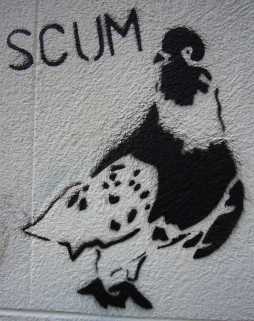
Tom Lehrer does stencil graffiti

...and in a rather swish part of Nottingham, too. For location guide, see here and click on 'aerial' or (better) 'bird's eye view'.

Friday, September 22, 2006

Bonus for enduring excuses

While we're in London (see below), please accept as a peace offering The Tomb of the Unknown Yuppie, which gave me a right start when I ran across it. Official title, date and so on here, which is also the source of the photo; all courtesy of here, as ever.

Monday, May 08, 2006

Balls: Divination

is the official title of the art happening I mentioned some time ago. It has now happened. This Saturday, in fact. It drew more people into Bromley House than would normally go in a week, which is an excellent thing: a crowd of, say, 100, with what seemed like 120 cameras.

The pantomime of preparing and anticipating and buzz went on about ten minutes longer than was comfortable, but the result was worth it. The ping-pong balls were luminous yellow, which I hadn't expected, and delivered by the artist, Phillip Henderson, from an adorable little lavender-blue suitcase. He declared himself more concerned about the sound than the appearance, so the librarian asked everyone not to clap; there was a few seconds' pause before we cracked. As it turns out, a hundred people applauding sounds very like 360 ping-pong balls descending a spiral staircase. I hope Mr Henderson enjoyed the echo.

Other people have blogged this first, of course. One also put a video on YouTube. Bless them.

Saturday, April 29, 2006

Today's major discovery

at least for me, is the Public Monuments and Sculpture Association's National Recording Project. You probably knew about it; it's been there for years, by the looks of things. It's a geographically arranged list of most of the public sculpture in "65% of the UK". It's wonderful. Best of all, many of the entries have photographs, so if you want to know what a real tourist trap looks like (description) or how all seaside railings should be (description), you can.

Monday, March 13, 2006

Hot news

On a certain Saturday in May, 360 ping-pong balls will descend this spiral staircase. Because of art.

Knowing the Bromley House library's membership procedures - which are friendly and fairly open but not quick - you would probably need to apply now to see it as of right.

They'll equally probably let in guests. But if you live in Nottingham, read, and have any spare time in office hours, you'll want to join.

Tuesday, November 08, 2005

Berliner to Berliner

Le Monde has had a redesign; by two blokes from The Scotsman, it says here. The result is that it now looks less like a late 1950s edition of the New Statesman and more like a newspaper: specifically, the new-style Guardian. The great Plantu is kicked downpage to make way for keylineless photographs and oddly light headlines in a subtly wedged serif -- although the absence of a quater-page features blurb at the top does make them look stronger. Judging by the fronts in PDF and the inside pages in their advertising blurb, they're also aiming for a five-column grid: Chris Brooke may be disappointed. I must buy a physical copy and find out what it really looks like.

Thursday, March 03, 2005

But where's the margin in that?

David Foster Wallace has an extraordinary-formatted-even-for-him new thing in the current Atlantic. (It annoyed The Elegant Variation, is how I know.) If you don't have the .pdf power to see, it uses pastel blocks over phrases in the main text to link to notes on pastel blocks in a generous, and sometimes expanding, scholar's margin.

One obvious accusation is hyperlink-envy; the look is vaguely reminiscent of a children's encyclopedia circa 1996. Mr Wallace being Mr Wallace, he also makes quite clever use of the ability to emphasise blocks with his notes, rather than mere points -- he has been upgraded to Spanish punctuation.

But this design also embodies a preference for sidenotes that seems to crop up every time people try to rethink texts -- so much more graphic than footnotes, so much less hierarchical. (See also Gray, Alasdair, Prefaces, Book of, The.)

And so much less readable! If the notes append anything more than chapter and verse, you get competing vertical movements on the page, which makes concentrating on one thing harder, and keeping your place when jumping about harder still. The effect is exaggerated on screen -- especially if you are also having to cope with anti-aliased Linotype Didot -- but it is real on paper. There are reasons why footnotes won this historical battle, and they go beyond the simple desire to use all available space.

You want an opinion on the words? Strong. It's a sketch of a talk-radio host, and it puts back in the shabbiness and the marginal (yes, visual pun time) hourly-rate workers left out of more conventional, hyped exposes. Result is maybe an overcorrection -- too much of the pity, not enough of the power -- but the correction was necessary, and it's adroitly done.

Monday, February 21, 2005

Flog it!

To appreciate the following, which is from S.N. Behrman's Duveen and quoted at slightly greater than normal length, you need to know that Duveen is Joseph Duveen, the greatest salesman in art history; Thompson is Joseph R. Thompson, the owner of a chain of restaurants; and "the Chicago dealer" is a lesser salesman who has run out of paintings expensive enough to sell Thompson and decided to throw him to the lion. The place is Duveen's New York gallery, the time somewhat before the great depression. Ready?

"Duveen led Thompson, as well as the Chicago dealer, into the lift, which bore them to sacrosanct upper regions. Duveen strode swiftly though a thickly carpeted, dimly lit room that contained six Old Masters reclining on easels. Thompson, in his way, was almost out of the room when, like Mrs. Lot, he looked back. He lingered; from the blur of the six pictures he got a quick impression of infinite desirability. He called the hurrying Duveen back. 'Here are some pictures,' he said. 'What about these?'

"Duveen took his arm. 'My dear Mr. Thompson,' he said gently, 'there is nothing in this room that would interest you in the least.'

"'Why not?' argued the new pupil. 'Of course they interest me. What would I be doing here if they didn't interest me?'

"'These pictures, my dear fellow, I am reserving, as a matter of fact, for a favourite client,' Duveen said. 'They will interest him far more than they could possibly interest you.'

"Thompson protested; he would yield to no one in acuteness of interest. 'Why do you think they wouldn't interest me?' he asked. 'I want you to know, Sir Joseph, that I own some pretty good pictures.'

"'I am sure you do,' Duveen said soothingly. 'And if you will just follow me, I am sure that I can add to your collection and, if I may say so, improve it. But not these. You are a busy man, and I don't want to waste your time. Not with these.'

"'Why not?' repeated Mr Thompson.

"Pushed to the wall, Duveen dropped all pretence of tact. He made it plain that he thought the pictures were over Thompson's head, both aesthetically and economically.

"'How much for the six?' Thompson demanded.

"'A million dollars, I am afraid,' said Duveen, as if pained at having to demonstrate the truth of an unflattering statement.

"Thompson was ready with an answer. 'I'll take them,' he said vindictively."

A virtuoso piece of dialogue construction, that, as well as salesmanship, with adverbs that do something. The aggravating "soothingly" is my favourite.

[Duveen, by S.N. Behrman, 1953. Jars and jars and jars of polish rubbed into a collection of stories pretty enough to stand it. Loose-ish overall structure because once a multi-part magazine profile, but elegantly tight within each chapter.]